In the era of Google Maps, every business should embed a map to its establishment directly on its website. It’s easy for any competent web developer to do and it’s free. Not having such a map is embarrassing.
Of course, we can sympathize with businesses who simply don’t have the resources to update their websites. Good web developers are not in infinite supply (and aren’t cheap), so the temptation to “leave well enough alone” is understandable.
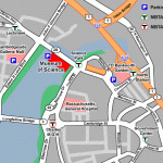
The Museum of Science still uses what I call a “hand-edited” map to highlight its location. Shown at left, it highlights some basic streets and key points of interest, but shows only the features its creator deemed important.
Hand-edited maps give a tolerable overview of a location. Someone familiar with Boston can glance at this and understand where the Museum is. However, someone new to the area will likely want more information. Where is it in relation to the hotel? What other T stops are in the area? Is this on the way to the airport? Are there restaurants nearby?
Large institutions can reasonably answer these questions with an “all singing, all dancing” map. Boston University Maps incorporates thousands of hours of human effort to catalog campus geography and area attractions, and the Massachusetts Bay Transportation Authority shows the location of every bus stop on every route in the city. These are excellent websites, and we should have more like them, but we also can’t expect the Museum of Science to single-handedly offer such a tool to its visitors.
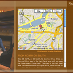
Fortunately, a “plain vanilla” Google Map is virtually effortless to install and offers all the context a visitor really needs. Suppose I’m interested in dining at Stephanie’s on Newbury — a nice restaurant in Boston’s Back Bay neighborhood. Their directions page offers just such a map. Building a page like this requires precisely six lines of particularly simple JavaScript, which the creator can copy directly from Google’s own examples (and just change the location).
This gives roughly the same level of detail as the Museum of Science does at first glance, but then any visitor can use the controls to pan and zoom, customizing the view. I can see immediately that the restaurant is in the Back Bay, and then zoom in to pinpoint its address on Newbury street. Someone only passingly familiar with the Back Bay might pan from side to side to find other nearby landmarks, then estimate how far the restaurant is from each.
For no added cost, Stephanie’s has provided an excellent geographical tool for its potential customers.
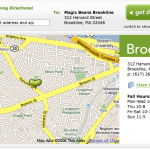
Many sites prefer to customize the “plain vanilla,” adding their own design elements. Magic Beans, a toy store in Brookline uses their own “bean” logo instead of Google’s pin, for example. This improves the site’s overall design while keeping all the functionality. The map still pans; the map still zooms.
Some sites — particularly those faced with extremely limited budgets or extremely inexperienced developers — take an acceptable shortcut by linking directly to Google Maps (without embedding a map in their site). Espresso Royale, a chain of coffee shops, offers such a link for each of their locations. Visitors again get the benefits of an interactive map, and site maintainers do slightly less work. We’ll still call that a win.
All these sites, faced with their own unique challenges, have done a good job. A site that hasn’t had time to update a page is not embarrassing. A site that’s updated to include a Google Map certainly isn’t embarrassing; it’s desirable. What’s embarrassing is a site that specifically updates its map page but still avoids making it interactive.
Moogy’s (a Brighton restaurant), Buttercup Bakeshop (a Manhattan cupcake shop), and the Center for the Performing Arts in Natick each opened Google Maps, took a screenshot, and embedded that on the page. Doing this takes longer than embedding a map properly, and offers a vastly inferior visitor experience. Those unfamiliar with the area are again confined to seeing only the landmarks the site designer hand-picked.
Some sites, staggeringly, go a step farther and give their screenshot an artsy treatment. The Bowery Poetry Club is one example, embedding a soft, faded copy of a Google Map in the lower right corner of the page.
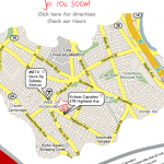
There’s also a great cupcake place in Davis Square that took a snapshot and then cropped it in an irregular shape. This particular site even has its own custom “popups” on the map for the restaurant and the Davis T stop.
Design is important on a website, but let’s not get carried away. That puts form before function. The map design won’t likely win over any customers, and it might drive away a few who can’t figure out where the business really is.
Put a stop to the madness. Put a map on every site, and make it a fully functional interactive version. It’s easy, it’s cheap, and it’s immeasurably useful to those planning even the simplest of outings.
(For the record, I’ll happily offer an hour of my time — gratis — to any of the sites mentioned that wants a proper Google Map.)


