Everyday Heroism

On Tuesday, February 23rd, gunman Bruco Eastwood shot and wounded two students at Deer Creek Middle School in Littleton, Colorado. Math teacher Dr. David Benke was outside patrolling the parking lot after school at the time. When he heard the first shot, he charged at the gunman and wrestled him to the ground.  Teachers Norm Hanne and Becky Brown were close behind.  Bus driver Jim O’Brien shouted at the students already on his bus to get down and make the bus look empty before he rushed out to help hold down the attacker.  Nobody was killed in the attack.

On Christmas Day last year, Umar Farouk Abdulmutallab brought explosives onto Northwest Airlines flight 253 in his underwear.  Passenger Jasper Schuringa put out the fire, burning his hands in the process, and then dragged the would-be bomber to the front of the plane to be restrained.  Nobody was killed.

Back in December of 2001, Richard Ried tried to light a fuse leading into the explosives his shoe on American Airlines 63.  Flight attendant Hermis Moutardier caught him in the act, and with the help of flight attendant Cristina Jones and other passengers subdued the 6’4″, 200 pound man, and restrained him with a seat-belt extension, belts, and headphone cords.  Jones remarked to Time magazine afterward:

Most of it was instinct, and the knowledge of the Sept. 11 attacks. I don’t believe I would have grabbed [Reid] the way I did had I not known about Sept. 11. I don’t know that the passengers would have come to my aid so quickly had they not known about Sept. 11.

Nobody was killed.

The attacks of September 11th, 2001, at the cost of of 2,976 lives, may have taught us the most valuable lesson we’ve ever learned: that apathy, complacency, and (above all) inaction can have greater costs than we might ever imagined.  We began that day with fantasies of terrorism where John McClane can rush to the rescue of anyone who sits quietly and stays out of the way.  We ended it understanding that even when resistance is as deadly as it was for the passengers of United flight 93, the consequences of inaction — of not being John McClane, if only for a moment — can be even greater.

While the Transportation Security Administration learned from Richard Ried that travelers need to remove their shoes before boarding an airplane, the public already knew not to tolerate lit matches on board a flight.  Even while we depend on police protection for our everyday safety, the police cannot be everywhere at every moment.  But Dr. David Benke and his peers can be — collectively — and can be able to act immediately in society’s defense.

One of the most moving and memorable speeches in Aaron Sorkin’s The West Wing (from 20 Hours in America) comes after a bombing at the fictional Kennison State University.  President Bartlett gives this address:

Forty-four people were killed a couple hours ago at Kennison State University.  Three swimmers from the men’s team were killed and two others are in critical condition when after having heard the explosion from their practice facility they ran into the fire to help get people out.

Ran into the fire.

The streets of heaven are too crowded with angels tonight.  They’re our students and our teachers and our parents and our friends.  The streets of heaven are too crowded with angels.

But every time we think we’ve measured our capacity to meet a challenge, we look up and we’re reminded that that capacity may well be limitless. This is a time for American heroes.  We will do what is hard.  We will achieve what is great.  This is a time for American heroes and we reach for the stars.

This is a time for American heroes, and we have them in abundance.
Stop Elimination Redux

In 2004, the Massachusetts Bay Transportation Authority closed four stops on the B Branch of the Green Line, to the approval of almost 73% of riders surveyed.  The stops remain closed today.  Now it’s time to close more.

Eliminating stops ultimately makes trips faster.  Each stop requires trains to accelerate and decelerate, and more importantly adds hold time at the platform as passengers board and disembark.  On crowded trips, the boarding process alone can take upwards of a minute at every stop even when everyone hurries.

The goal in any mass transit system must be to separate stops as widely as possible without unnecessarily inconveniencing riders.  The question is what distance is both “far enough” without being “too far.”

Underground stations on the Green Line between Government Center and Kenmore (where B trains run) are spaced 583 meters apart, on average.*  That’s about the distance diagonally across Boston Common, and about the same density of stops in Manhattan. Of course, passengers will generally walk only half that distance to get to the closest station.

Above ground, however, between Kenmore and Packard’s Corner, stops are only 306 meters apart, or about the length of a single crosstown block in Manhattan.  Imagine a New York subway train stopping every block!  Some of these need to be eliminated.

Of the eight stops in question, the shortest trips are from Boston University East to Boston University Central and from Boston University West to St. Paul Street.  The middle segment, from West to Central, is the longest.

Suppose we keep West and Central as they are, then, and eliminate the adjacent stops, beginning with St. Paul Street, barely a block away.  Babcock Street could also go, putting the three remaining stations 416 and 546 meters apart, respectively.  That’s about the underground average.

Across the turnpike, Boston University East is also a perfect candidate for removal based on distance, and I support that, but it’s also benefited immensely from the costly beautification work done there just recently, so I don’t have high hopes for its elimination.

The only valid counterargument I’ve heard to eliminating any of these stops is that the individual platforms are not large enough to support the required number of passengers.  In other words, the reason St. Paul Street and Boston University West are practically touching is so they can act in combination as a larger platform.

Anecdotally, I’ve never seen such a problem.  The crowds on these platforms are light, even on heavy rush hour trips that are far behind schedule.  During the Boston University Commencement, which surely generates the heaviest travel in the area, crowds would overhwlem any platform, which is why we always see MBTA staff supervising operations (and, at least last year, manually turning the entire platform into a fare-controlled area).

However, if there’s real evidence against these platforms’ adequacy, there are several solutions.  First, they can easily be lenghtened.  Even if four-car trains will never arrive (as seems likely, since we have yet to see even three-car trains in regular service), a four-car platform is perfectly usable.  Second, and admittedly costlier, sacrificing a few parking spaces would allow ample room to widen the platforms into the street — a small price, even in Boston.

Most importantly, crowds at every platform will diminish as service speeds up.  Fewer people can gather during a five-minute window between trains than can in a window that’s 15 minutes long.

We need to eliminate these stops.  Let’s skip over them for six months, and if crowds on any platform truly become unmanageable, we can put them back in just as easily as they came out.  If, instead, there’s no harm and service gets faster, at least 73% of riders will be made happier.

*I performed all measurements in Google Earth using the “ruler” tool.  For underground stations, I used Google’s placement of the station icon to estimate the platform’s position.

Dynamic Looping: Making the T More Reliable

The MBTA needs to explore a simple, low-cost (perhaps free) solution to one of the Green Line’s  most common and most noticeable problems: trains bunching together.  Dynamic looping, as I’ll call it, lets inbound trains get reassigned easily and transparently to different outbound lines.

Any regular rider knows that trains tend to come in pairs, and can sometimes emerge from the subway in groups of four or five at a time.  After 30 minutes without any service, a stream of trains will roll by together — the first few packed to capacity, and those behind nearly empty. Although this is a maddening failure to provide transportation, its causes are easy to understand.  Traffic lights turning red, inconsiderate or inattentive drivers stopping on the tracks, pedestrians running in front of trains, and other routine parts of city life all impose delays.

Every second that a train gets behind schedule allows more passengers to accumulate at upcoming stations.  A larger crowd of passengers takes longer to board, so the train is even more delayed at the next station, and the problem cascades.  Meanwhile, as the following train catches up, even fewer people accumulate at each stop so the later train can quickly find itself tailgating its predecessor with hardly any passengers aboard.

Many expensive capital projects could improve services.  With limitless funds, burying the B Line up to Packard’s Corner would be a smart move.  More realistically, the T could let trains preempt traffic signals (extending green lights a little longer if a train is about to pass through) as many other cities do.  Even that, however, would require new equipment that the MBTA cannot afford.  We need a free solution that we can implement with the resources already on hand.

Let’s accept that delays above ground are inevitable but that not all lines will be delayed in the same way at the same time.  Currently, underground stations usually see a fairly steady stream of trains.  Unfortunately, they are not distributed evenly among the four branches. A trio of B trains might pass uselessly by passengers who have been waiting for a D train who then crowd into the next D car when another is right behind it.

Since we accept that delays are inevitable on the inbound trip, we can assume that B and D trains will tend to arrive at Government Center (their last stop) in pairs spaced closer together than when they left Boston College or Riverside.  Currently, those poorly spaced trains will loop at Government Center and start their outbound trips to the same place they originated, incurring more delays all the time.  By Washington Street on the B and C lines, all hope is lost, and trains are frequently sent “express” to the end of the line.

By introducing dynamic looping, delays can be corrected or even eliminated halfway through the trip.

When a train arrives at Government Center, it should begin outbound service on whichever branch needs it most.  If the last B train left 10 minutes ago and a D train left just 3 minutes ago, the next train should make Boston College its destination.  Later, when a pair of delayed B trains arrives together, one can service the Riverside branch.  By routinely reassigning trains in this manner, delays are either balanced across multiple branches, or in some cases eliminated entirely.

Until recently, Type 8 cars couldn’t run on the Riverside branch, so Boston College and Riverside trains were not interchangeable.  However, since at least December, Type 8 cars have been in regular revenue service on both branches.  Now is the perfect time to implement this simple and affordable system.

No passengers would even need to be aware of this new policy.  Both branches begin their service at Government Center, so people waiting on the platform would not have any prior expectation about which train might appear next.

Unfortunately, this is not true for the C and E lines.  Their inbound trains run to North Station and Lechmere respectively.  Even excluding them, dynamic looping can improve service on two lines.  However, with a more dramatic change, we could expand the program to all four branches.

First, all trains could be reassigned when entering Government Center.  Some B and D trains might continue north (as though coming from Heath Street or Cleveland Circle), whereas some C and E trains might discharge their passengers and loop.  This would add complexity that dispatchers would need to unravel, and would confuse (and presumably annoy) many passengers.

Alternatively, all trains might terminate at Government Center.  This would simplify the dispatcher’s job to that of tracking which of the four branches most needs the next train.  Service to the north would come from shuttle trains operating on Government Center’s inner loop — a stretch of track already in place for southbound trains to turn around and return north.

These shuttle trains would be operating entirely on dedicated rights of way (underground or on overpasses), so their schedules should be inherently more reliable than the trains at street level.  This would lessen another major complaint about the Green Line: that service to North Station is too unpredictable (another symptom of the same basic problem).

This is a more dramatic step, of course, whose disadvantages shouldn’t be overlooked.  Someone who works on Beacon Street in Brookline and commutes via the Commuter Rail might be pleased at having more regular and reliable service, but might be displeased at suddenly needing to change trains at Government Center.  This is an area that requires further study from past occasions when the T has changed a line’s terminating station.

Even without the C and E lines, however, a pilot program with just the two branches that already loop at Government Center is worthwhile.  Dynamic looping could make a big difference in performance and passenger satisfaction.  At a time when use of mass transit is rising, but when no funding is available for major capital improvements, this simple solution could go a long way.

It’s time for a change.

Art and Cartography

In the era of Google Maps, every business should embed a map to its establishment directly on its website.  It’s easy for any competent web developer to do and it’s free.  Not having such a map is embarrassing.

Antiquated "Museum of Science" Map

Antiquated "Museum of Science" Map

Of course, we can sympathize with businesses who simply don’t have the resources to update their websites.  Good web developers are not in infinite supply (and aren’t cheap), so the temptation to “leave well enough alone” is understandable.

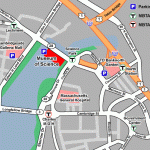
The Museum of Science still uses what I call a “hand-edited” map to highlight its location.  Shown at left, it highlights some basic streets and key points of interest, but shows only the features its creator deemed important.

Hand-edited maps give a tolerable overview of a location.  Someone familiar with Boston can glance at this and understand where the Museum is.  However, someone new to the area will likely want more information.  Where is it in relation to the hotel?  What other T stops are in the area?  Is this on the way to the airport?  Are there restaurants nearby?

Large institutions can reasonably answer these questions with an “all singing, all dancing” map.  Boston University Maps incorporates thousands of hours of human effort to catalog campus geography and area attractions, and the Massachusetts Bay Transportation Authority shows the location of every bus stop on every route in the city. These are excellent websites, and we should have more like them, but we also can’t expect the Museum of Science to single-handedly offer such a tool to its visitors.

Stephanies on Newbury

Stephanie's on Newbury

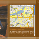
Fortunately, a “plain vanilla” Google Map is virtually effortless to install and offers all the context a visitor really needs.  Suppose I’m interested in dining at Stephanie’s on Newbury — a nice restaurant in Boston’s Back Bay neighborhood.  Their directions page offers just such a map.  Building a page like this requires precisely six lines of particularly simple JavaScript, which the creator can copy directly from Google’s own examples (and just change the location).

This gives roughly the same level of detail as the Museum of Science does at first glance, but then any visitor can use the controls to pan and zoom, customizing the view.  I can see immediately that the restaurant is in the Back Bay, and then zoom in to pinpoint its address on Newbury street.  Someone only passingly familiar with the Back Bay might pan from side to side to find other nearby landmarks, then estimate how far the restaurant is from each.

For no added cost, Stephanie’s has provided an excellent geographical tool for its potential customers.

Magic Beans Map

Magic Beans

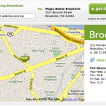
Many sites prefer to customize the “plain vanilla,” adding their own design elements.  Magic Beans, a toy store in Brookline uses their own “bean” logo instead of Google’s pin, for example.  This improves the site’s overall design while keeping all the functionality.  The map still pans; the map still zooms.

Some sites — particularly those faced with extremely limited budgets or extremely inexperienced developers — take an acceptable shortcut by linking directly to Google Maps (without embedding a map in their site).  Espresso Royale, a chain of coffee shops, offers such a link for each of their locations. Visitors again get the benefits of an interactive map, and site maintainers do slightly less work.  We’ll still call that a win.

All these sites, faced with their own unique challenges, have done a good job.  A site that hasn’t had time to update a page is not embarrassing.  A site that’s updated to include a Google Map certainly isn’t embarrassing; it’s desirable.  What’s embarrassing is a site that specifically updates its map page but still avoids making it interactive.

Moogy’s (a Brighton restaurant), Buttercup Bakeshop (a Manhattan cupcake shop), and the Center for the Performing Arts in Natick each opened Google Maps, took a screenshot, and embedded that on the page.  Doing this takes longer than embedding a map properly, and offers a vastly inferior visitor experience.  Those unfamiliar with the area are again confined to seeing only the landmarks the site designer hand-picked.

Artsy Google Map

Artsy Google Map

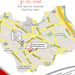
Some sites, staggeringly, go a step farther and give their screenshot an artsy treatment.  The Bowery Poetry Club is one example, embedding a soft, faded copy of a Google Map in the lower right corner of the page.

There’s also a great cupcake place in Davis Square that took a snapshot and then cropped it in an irregular shape.  This particular site even has its own custom “popups” on the map for the restaurant and the Davis T stop.

Design is important on a website, but let’s not get carried away.  That puts form before function.  The map design won’t likely win over any customers, and it might drive away a few who can’t figure out where the business really is.

Put a stop to the madness.  Put a map on every site, and make it a fully functional interactive version.  It’s easy, it’s cheap, and it’s immeasurably useful to those planning even the simplest of outings.

(For the record, I’ll happily offer an hour of my time — gratis — to any of the sites mentioned that wants a proper Google Map.)

All Aboard

The Green Line rolling stock (that means “trains”) includes two different types of car:

  1. The Type 7 car, manufactured by the Japanese firm Kinki-Sharyo starting in 1986
  2. The Type 8 car, manufactured by the Italian firm Ansaldobreda starting in 1999

The newer cars, although cleaner and more “modern,” are worse.

Their big attraction is that the floor in the center is lower, so with only slightly elevated platforms passengers in wheelchairs or with strollers can roll on and off easily.  There’s also space to park those wheelchairs and strollers right beside the door.  (Older cars inexplicably put that space halfway between doors.)

These are absolutely admirable features, for which the T (and Ansaldobreda) should be congratulated.  The Type 8 cars are still inferior.

Just watch savvy commuters when a train arrives with one car of each type.  This morning, every single person at my stop literally ran from the Type 8 car that stopped directly in front of us to the Type 7 car behind it.  That was a bit extreme, but seeing people favor the older cars is entirely common.

Why?

Let’s start small: the older cars have more seats.  They have 46, to be precise, of which eighteen are single seats (the rest are pairs).  The newer cars have 40 total, and only four singles (the rest are long benches in each section of the car).  But that’s just being petty.  More people can stand than sit on just about any subway car, so the real problem is with the “standing space” configuration.

First, there are wide expanses of open space by each door with limited handholds.  Nobody can balance there when going around sharp corners, and it’s potentially dangerous during a collision.

Second, most seats face across the train (not forward and backward), so people’s legs are in the aisle.  That’s fine on a wider “heavy rail” subway car (like the Red Line, or in New York), but in the narrow “light rail” cars people are reluctant to stand two-across in that space.

Third, there are too many “choke points.”  People stick to the walls of a subway car like cholesterol to an artery.  Take a look at the car.  After boarding, a lot of people won’t walk down the steps, so the front portion of the car clogs quickly.  If you get through that, you next encounter the narrow middle portion, where people also stop, further blocking the aisle.  Then there’s another staircase, which keeps people from utilizing that “back deck” even on some very heavy trips.

Standing Space in the Type 8 Car

Standing Space in the Type 8 Car

In a perfect world, everyone would move out of the way, and let new people aboard.  In the real world, cars need to be designed to facilitate boarding despite inconsiderate or unaware passengers.

We could forgive these failings if the cars were more reliable or safer, but they derailed and broke down so often when they first started running that the T has since declined to buy anything else from Ansaldobreda.

We’ll pretend the mechanical failings are why we dislike the newer cars so much, but the reality is: we just don’t like them.  To the T: until you can replace the fleet with better vehicles, at least keep running two-car trains with one car of each type.  We’ll be happier that way.

Fare Collection? Prove It!

I sympathize with the T’s difficulties collecting fares on the Green Line.

Traditionally, subway stations (in New York, for example) separate train platforms from the outside world with fare gates.  To get to the platform you have to pay the fare, so when a train arrives everyone can step on immediately.  Many Green Line stations are immediately adjacent to the street, though.  Equipping these with any sort of fare gate would be logistically untenable.

Commuter Rail stations are often similarly situated, but their stops are farther apart.  Conductors can let everyone aboard freely and then collect fares en route.  With some Green Line stops only a block apart, there’s no time for that.

Buses seem like a great model for these streetcar-like trains.  Stops are closely spaced and street-adjacent.  Bus drivers, of course, police fare collection as passengers board through the front door, but on a 22 meter Green Line train one door isn’t enough.  Either passengers will end up “stuck” at the back when they need to alight, or (more likely) people will cluster near the front door, leaving the rest of the car underutilized.

Adding to the unique challenges of the Green Line is one common to most transit systems: everyone’s going the same way.  People commute into the subway in the morning and back out in the evening.  On the Green Line, this means most people are boarding inbound trains at the tricky above-ground stops, but boarding outbound trains at the more traditional underground stations.

The T has tried some interesting solutions to these problems.

Through the end of 2006, for example, outbound trips were free above ground.  The many people disembarking at every stop could use any door.  On inbound trips, they only needed the front door generally, since very few people would need to exit before the subway (and they could stay up front).

For rush hour trips, when one door is simply insufficient, the T tried a “Show-and-Go” program, where passengers with a pass could hold it up while boarding.  An inspector might be on hand to supervise and police the process, or it might be largely an honor system.

In 2007, CharlieCards came out in full force: plastic cards that store cash value and/or monthly passes in electronic form.  Inspectors were then stationed on platforms with hand-held card readers, collecting fares before trains arrived.

These policies express trust in passengers, while still supporting fare collection.  Some people might try to sneak aboard during “Show-and-Go” with an expired pass (or no pass), and some might slip unnoticed onto a platform while an inspector’s back is turned, but they might also be caught and made to pay.

The inspectors disappeared after a few months, leaving mild chaos in their absence.  They’re back now, but without their card readers—their one weapon in fare collection.  Reduced to the role of “hall monitors,” they now just ask everyone to board through the front door only, sacrificing efficiency for rigidity.

This is insulting.  Morally, I’m entitled to board any train I want: I paid the T $59 for the privilege.  Of course, I expect to have to prove that, so I’ve carried a valid monthly pass each and every time I’ve stepped onto MBTA property.  The insult isn’t the request for passengers to prove they paid; the insult is the assumption that we haven’t.  It’s a subtle but critical distinction.

Assuming most passengers are like me—honest commuters just trying to get to work—the T should let us aboard freely.  To catch fare evaders, ask passengers randomly for proof of their payment.  Many transit systems, including some in California and many abroad, use just such a “Proof of Payment” system.  The T even promised one in 2007, but then never followed through.

Through signage and announcements, ask those paying cash to board at the front door, while letting everyone else board unchecked.  Then have inspectors patrol trains and platforms, asking for proof of payment.  Cash-payers can show a receipt, and everyone else can show their CharlieCard or CharlieTicket.  When you find someone with no payment, levy a $400 fine.  (The current fine for fare evasion is $25.)

Catching one person can then cover the revenue lost from 199 other fare evaders!  Sure, the math is more subtle than that after accounting for people who won’t pay the fine and for the inspectors’ salaries, but it’s workable.

An approach like this restores trust in honest commuters: we can board efficiently at any door.  Cash fares are largely unaffected: they board the front door, like in any of the previous systems (and a good system of warnings for out of town or first-time fare evaders will make it even more transparent).  And true fare evaders?  They finally pay up.

Personally, I’ll strongly support any move toward this system, whether implemented through MBTA policy, or through Massachusetts law.

Maximum Security Shirt Packaging

I readily admit that some packaging is necessary for our economy to function – I’d have a hard time getting a gallon of milk home from the store without a container of some kind – but let’s consider for a moment the packaging that comes with men’s dress shirts:

  1. An outer plastic bag
  2. A sheet of paperboard inside to keep the shirt pleasantly flat
  3. A cylinder of paperboard or plastic in the collar to keep it straight
  4. A bit of plastic in the opening in the collar, covering the topmost button, for no readily apparent reason
  5. Two pins holding the collar in place
  6. Between two and six pins holding other parts of the shirt in place
  7. Between one and three tags affixed to various parts of the shirt with sizing and pricing information (not the label that’s sewn into the shirt, but separate, removable labels)

Not one of these elements serves any practical function.  It all exists to make shirts look presentable in stores.  The cost of that presentation is not only harm to the environment through wasted resources, but also wasted time when buyers have to undo all those elements for every new shirt.

Manufacturers need to eliminate every single packaging element, leaving only the material consumers actually want: a new shirt.

Stores can handle this new arrangement in (at least) two different ways.  The easiest is to put shirts in bins, with samples on display on mannequins, or even pinned up if they want.  Shoppers could then pick out the sizes and colors they want.

Most people would probably say that’s inelegant or low class.  Fine.  “High class” establishments can do what they’ve always done for sweaters, pants, ties, and myriad other forms of sartorial essentials: fold piles of shirts neatly on tables.  Yes, shoppers will mess them up, so the same clerks straightening sweaters will now also need to straighten the shirts.

Such a change would be so easy to implement that tolerating the status quo is irresponsible.

Arithmetic is Useful in the Real World

I was momentarily excited to learn about a program called “Audience Rewards” – a loyalty program for Broadway shows.  Earn points for buying Broadway tickets, then redeem them for free seats or other items.  Sounds great, right?  Let’s look at the numbers.

Members earn two points per dollar spent on regular tickets (i.e., neither discounted nor premium).  Most orchestra seats cost about $112.  That’s 224 points per ticket – more on some nights of the week, or for some pricier shows.

To get a free seat, priced anywhere from $65 to $125, members must redeem a whopping 17,000 points!  That includes not only center orchestra seats at $112, but also the cheapest available rear mezzanine seat for Avenue Q on a Tuesday night, at $66.50.  Let’s review.  I’d have to spend $8,500 on at least 66 tickets just to earn a single free seat – a return of as little as 0.78% (or at most 1.4% on a $125 seat).

My credit card offers about 1.8% cash back, so that may seem about right, but I earn points with my credit card on every purchase every day.  I can earn points quickly, and cash in small amounts if I want – 4,500 points is a typical $50 gift card.  A better model for Audience Rewards to follow would be airlines’ frequent flyer programs.  Let’s take a look.

Airtran’s A+ Rewards program gives a free one-way trip after buying eight one-way tickets.  Bolt Bus offers exactly the same terms for bus rides.  That’s a return of one eighth or 12.5% – over 15 times better than what Audience Rewards has to offer!  On Delta, six round-trip flights to Denver (about 4,200 miles, depending on the route) earn a free round-trip ticket.  Now we’re up to a 16.6% return.

And we can do better than that.  My math there assumes that all airline tickets are priced equally.  In reality, an A+ Rewards member could easily buy eight $59 tickets and redeem a free $230 seat – a return of a whopping 48.7%.

Audience Rewards, you’ve really missed the mark.  I’d have to buy a $112 ticket to a Broadway show every week for 1.5 years to earn a single measly free seat!  And we all know I couldn’t cash in points for a just a free ticket anyway – I’d save up my $9,550 investment in tickets to get a free Spring Awakening poster. I could buy one now for $20, but it just wouldn’t be as rewarding.

Metrorail, Heal Thyself

I’ve upheld the Washington Metrorail system as something of a paragon of a good subway system since I first visited the city in 1999.  Washington needs to fix some basic faults, though.

Let’s start with an easy one.  Directional signs are prone to showing an arrow beside words like, “For (dot) service,” where the “dot” is actually a colored circle – to those who aren’t color blind, at least.  To those who are, it’s as descriptive as me writing “dot.”  Signs on, say, the Green Line in Boston are all colored a bright green, but then in black-on-white lettering underneath we see the words, “Green Line.”

I applaud wholeheartedly the words printed at the bottom of the Metrorail system map “Metro is Accessible.”  In Boston the system map carries footnotes like (I swear I’m not making this up), “State: Blue Line wheelchair access outbound side only.”  We absolutely should do everything we can to allow wheelchair users full access to our transit systems (and other places), but why do all the hard work to support wheelchairs and then blow it on color blindness by not adding some simple words to the signs?

What’s worse, station signs seem to be deliberately hidden.  They’re poorly lit, and almost impossible to see from inside the trains.  I ride the T every day and I’ve never had trouble navigating the New York City subway.  When I find myself sitting in a train thinking, “I wish I knew which stop this is,” something has gone wrong.

Compounding this problem, station announcements are still made manually, even on a system whose trains themselves can be operated by computers.  Even Boston’s Green Line, built (in part) in 1867, now features clear, enunciated, automated station announcements.  What keeps Washington from adding this technology?

Washington, you’ve lost my vote in the transit wars.  Sure, Boston could benefit from signs counting down the minutes until the next train’s arrival, but at least we know where our stations are.

Never a Free Lunch

I believe two things.  First, we are entitled to a high degree of customer service every time we interact with a business.  Second, most complaints about poor service are born of unreasonably high expectations, ignorance, poor logic, or some combination of the three.

When I worked at the Residence Inn I faced a number of severely irate guests who we’d had to “walk” – that is, offer them a free night’s stay at another hotel because we’d overbooked.  They were furious that we couldn’t honor their reservation, even though without asking we were paying for their stay elsewhere.  Why not take the free room in peace?

I tried booking a ticket on LimoLiner for my return trip from New York last week.  It’s a luxury bus service I’ve never tried before featuring on-board Internet, meals, entertainment, and other amenities.  Unfortunately they called and e-mailed eight hours before the trip to announce the bus had broken down and they’d be refunding my ticket.  I could find alternate transportation, or I could get a free ride from them on a “replacement vehicle.”

I opted for the free ride, rather than take time out of my stay to call Amtrak.  Admittedly I regret that decision, and would have been much happier on the train, even if it took time to arrange.  The woman sitting behind me, however, talked on the phone as though she’d been tied to the roof and dragged home in the pouring rain.  She’ll never ride LimoLiner again.  Me, I’ll give them another try – I’ll just be sure to make alternate arrangements if they cancel another trip on me, which they made it easy to do by notifying me well in advance and automatically refunding my ticket.

There are legitimate customer concerns.  Vincent Ferrari’s infamous AOL cancellation recording two years ago got huge attention online (with a splash of NBC fame) by showing how hard it can be to achieve even a simple account cancellation.  The infamous Verizon Math call illustrates the need for billing agents to know basic arithmetic.  Anybody you ask will have a story about how hard it was to understand the thick accent of a “support specialist” overseas.

Screaming and yelling about routine failures leaves us no ammunition when a genuine problem occurs.  If LimoLiner had canceled my trip outright and left me stranded in New York, unable to find an alternate route home (unlikely as that is), how could I have expressed the severity of the problem or my displeasure when screaming over the phone would have instantly lumped me together with the whiners out to score a free lunch?