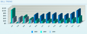
Our new provider of heating gas in Colorado is Xcel Energy. They have an elaborate Flash-based website for customers which includes this graph of usage history:
I see three key problems here.
First, the “3D” effect is widely known to distort perceptions of data. It’s too easy, for example, to see those last two dark bars as depicting similar magnitudes since the leading edge of one is so close to the trailing edge of the other. This chart has a single dimension of data (“cost”), so it needs a one-dimensional presentation. “Pretty” is confusing — what Edward Tufte calls “chartjunk.”
Second, the chart overlaps data from three years, emphasizing comparisons between costs in the same month of different years, while making the long-term trend difficult to identify. Are we actually spending less this year than last? This arrangement of data is particularly troubling since peak usage is naturally in the winter, which always spans two calendar years. Having so much historical data is a privilege; let’s see it all laid out chronologically.
Finally, what’s plotted is not actually “usage” at all, but “cost.” It’s impossible to tell from this chart alone whether we used less energy this year or if rates fell. In fact, our dramatically higher costs in 2008 were from a previous residence where Xcel provided both gas and electricity. The cost was higher, even if our gas usage was lower. We need charts that show our energy usage (in kilowatt hours or in cubic meters, as appropriate), not how much money we’ve spent.
