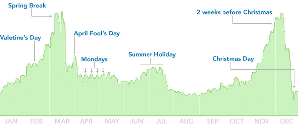
In a TED Talk in July, designer David McCandless highlighted some interesting data, including data from Facebook analyzing when people end their relationships.
Plotting the information in 10,000 status updates shows what times of year see the most breakups, and it looks like we’re headed into one of the worst seasons. Apart from the strategically placed highs and lows (e.g., hardly anybody breaks up over Christmas) what I find most fascinating is the apparent constant, inescapable breakups that are happening every day of the year.
I’d love to see what the graph of people beginning relationships looks like. I’m betting some parts of it overlap (suggesting people are breaking up because they’ve found someone else) while others may show gaps indicating more people tend to be in (or out of) relationships at a particular time of year.
These data are reminiscent of those on the OkTrends site I found in April. Neither is an exercise in inarguable statistics from random samples, but for the people who are included (i.e., those who self-selected to use Facebook or OkCupid) we get a truly fascinating picture of their social lives we may never otherwise have seen.
(via The Atlantic, via designer Mathias Mikkelsen).
