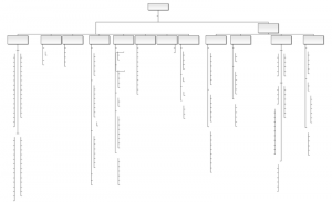
I don’t habitually monitor the organizational chart for my department, but after some important changes recently I downloaded the latest version. This is what it looks like:
It’s important to understand here that I didn’t just delete names from this diagram; that’s really how it looks. Evidently we have some vacancies to fill.
(I’ll take some comfort from being able to deduce exactly where my name should go from the outline alone.)
