Since I’m currently working on a new application for our help desk, we’ve been evaluating features in other, existing applications. We considered, among others, a hosted solution called “Service Now.”
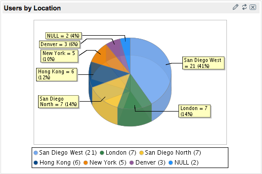
Immediately after logging into the demo site, we saw this traumatizing departure from any known laws of graphic design:
Someone has evidently decided that since 3D pie charts are known to distort human perception of data, what will really make them useful is a layer of translucency.
