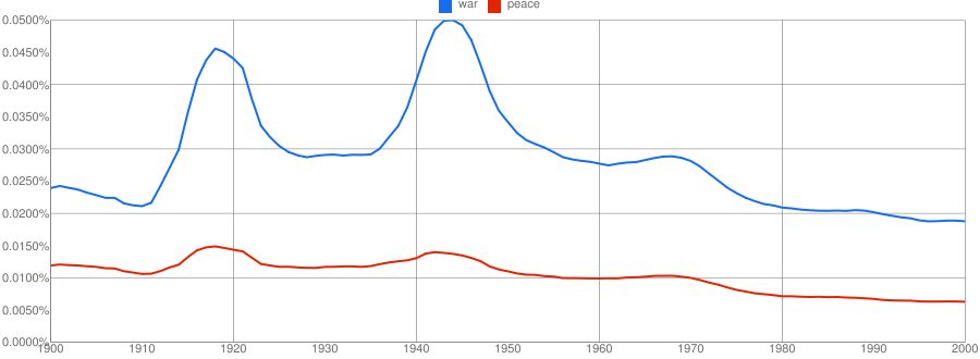
Google Labs has a new toy to play with: the Google Books Ngram Viewer. The tool graphs how frequently words and phrases appear in all the books in Google’s library, dating back to 1500.
As one simple example, a search for war will show some things anyone with a decent high school education would expect: the word was used far more frequently around 1916 and 1944 than at any other time on record. Meanwhile, a search for “hamburger” shows an inexplicable (at least to me) sharp uptick in use of that word between 1930 and 1940, consistent usage levels for 25 years, and then another dramatic climb lasting into the present.
What makes the tool especially interesting is that you can plot multiple terms on the same axes in order to draw comparisons. Here’s a search for “war,peace” that shows something a bit more subtle. After a slight uptick in use of the word “war” leading into 1970, use of both “war” and “peace” fall dramatically — both to lower levels than we’d seen in 200 years.
Every search I’ve tried has had interesting characteristics that suggest something about our society — or at least about what people are writing about it. See how often “Russia” and “USSR” have been used. Limit a search to just British English books and compare uses of London and New York over time. Search for “potato,rice,corn” and see which side dish is mentioned most often. Politics, entertainment, history, and fantasy can all be graphed. And while it’s not always obvious what the data are telling us (if anything), it sure is an addictive toy to play with.
